Enduro Corporate Identity
Branding
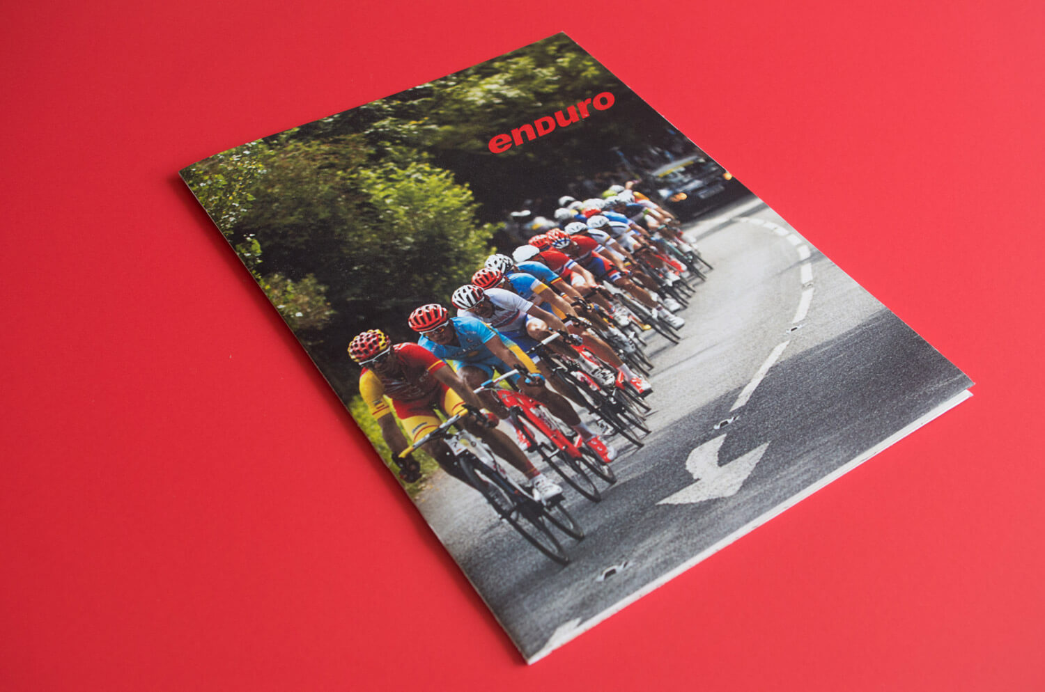
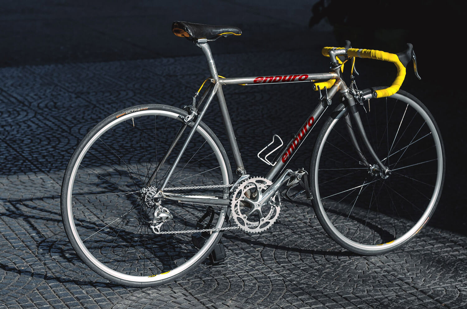
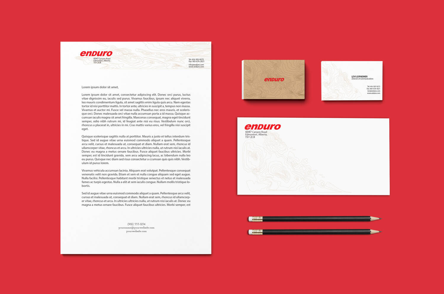
Enduro is a bicycle company that specializes in high-end mountain and road bikes for racers. Their target market encompasses those who are passionate about riding and performing at a peak level. Enduro prides itself in selling good quality bikes and providing excellent customer service and warranty on their products.
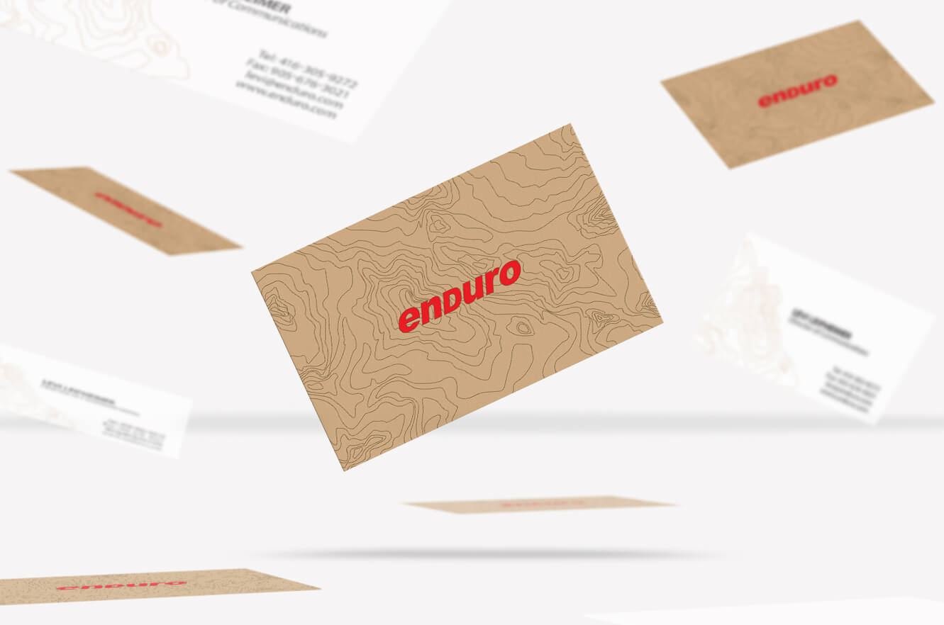
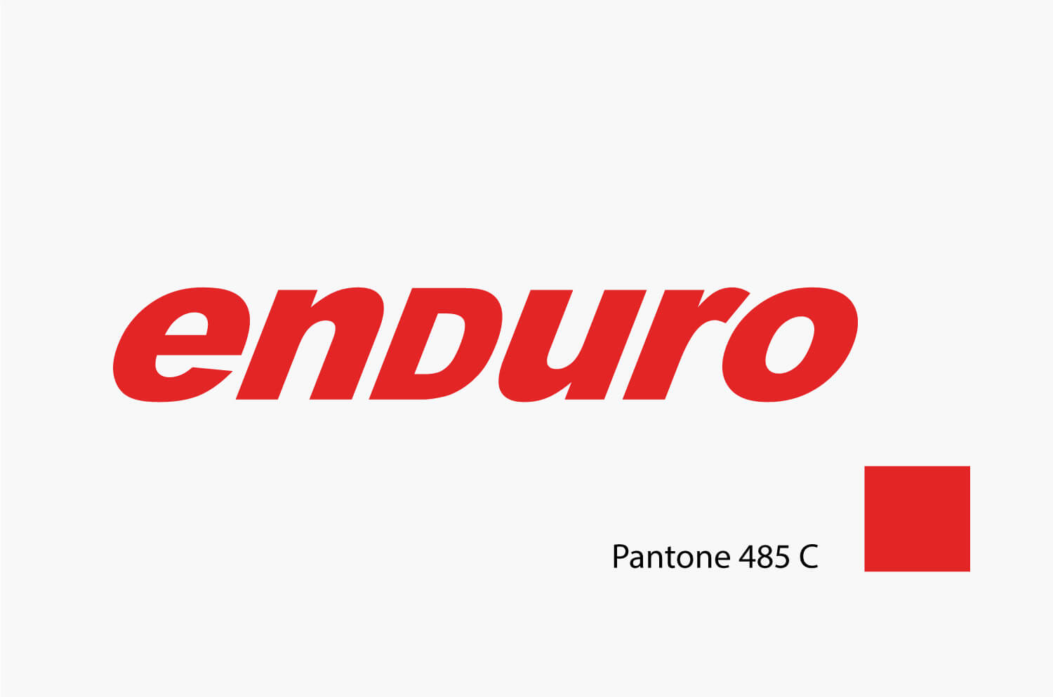
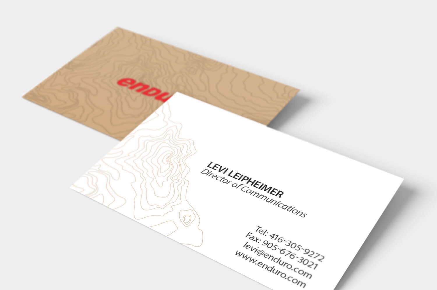
I created a strong, bold, and sleek logo that aligns with Enduro’s brand values. The Arial Black typeface was slanted to convey a sense of speed. The vibrant red Pantone 485 C spot colour symbolizes strength and power.
The motif on the stationary represents a topographical map since conquering mountains and hills is both a challenge and goal for many bikers. The topographical pattern is repeated on Enduro’s business cards, letterhead, and envelopes.

 all projects